Layout Guidelines
- Basic Unit of Measure
- Why was 12 px chosen to represent a basic design unit?
- Applying the Basic Unit of Measure
- Putting It All Together
To promote a sense of visual harmony across a wide range of applications, Spark provides the following recommendations on how to combine components into complex patterns and screen layouts.
Basic Unit of Measure
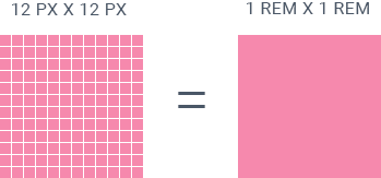
In Spark code, measurements are recorded in rems. A rem is a relative size that allows elements to scale better between different screen sizes and device types. One rem is equivalent to 12 pixels in design software such as Photoshop or Illustrator. Every spatial and layout design decision should reference this basic measurement.

| Rem | Pixel |
|---|---|
| 1 rem | 12 px |
| 2 rem | 24 px |
| 3 rem | 36 px |
| 4 rem | 48 px |
| 5 rem | 60 px |
Why was 12 px chosen to represent a basic design unit?
High Level of Divisibility
Aligns with 12 Column Grid

Easily Manipulated to Meet Mobile Touch Standards
Applying the Basic Unit of Measure
Based on the basic unit of 12 pixels/1 rem, all layout decisions are informed by a vertical baseline grid and the responsive grid.
Baseline Grid and Vertical Spacing
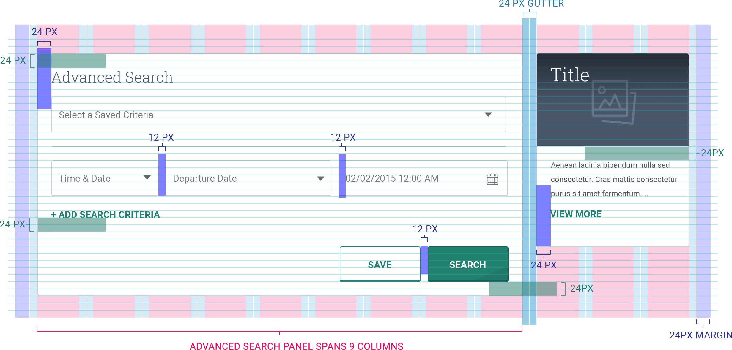
Our vertical baseline grid is the key to achieving vertical rhythm. Vertical rhythm is the balanced spacing of elements as the user moves down the page. It is created by three factors: font size, line height and margin or padding. The diagram below shows how vertical spacing in 12-pixel increments helps create hierarchy and harmony between text and containers.

Responsive Grid and Horizontal Spacing
While the baseline grid informs vertical spacing, the responsive grid is key to understanding horizontal positioning of elements on a screen. Similar to the baseline grid, the responsive grid is based on the basic unit of 12 pixels/1 rem.
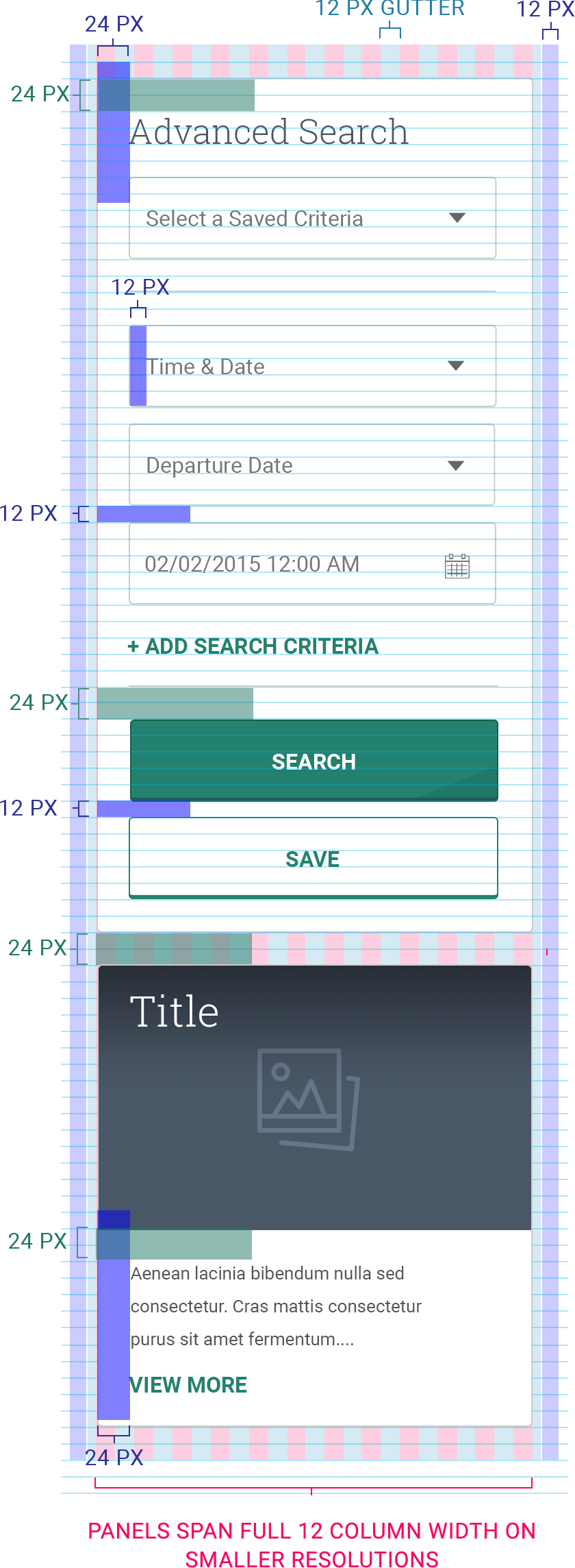
A good rule of thumb to remember is that panels and content containers typically have 24px in between one another, while similar UI components such as button groups and related form fields have 12px.
Use varying increments of 12px to create hierarchy and groupings within layouts. Refer to the examples below for details.
Gutters remained fixed at 24px.
Columns adjust with device width
View Responsive Grid for more information.
Putting It All Together
By applying the basic unit of measure to all vertical and horizontal spacing decisions, designers can maintain consistency within their PSD files, and developers can more accurately translate design files into working code. Ultimately, this results in designs that reduce visual clutter, support ease of use and build confidence among users.
Spark offers a set of CSS classes to solve small, common problems and enforce consistency within page layouts.

