UI Components
Containers & Navigation
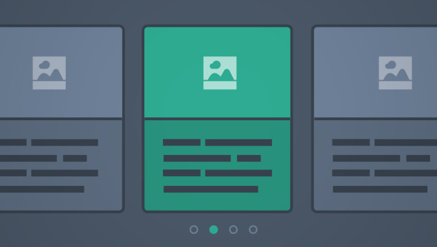 Carousel
Carousels allow users to cycle through a series of related content within a single row of space.
Learn More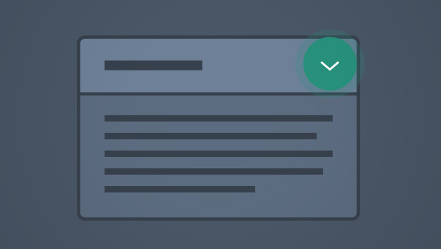 Expand & Collapse
Expand/collapse allows users to toggle between displaying and hiding a section of content.
Learn More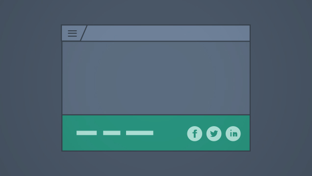 Footer
A footer appears at the bottom of all pages and provides access to links and other content.
Learn More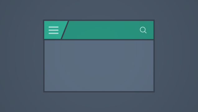 Header & Navigation
A header appears on every screen and provides navigation to main sections within the application. It may also include branding and persis...
Learn More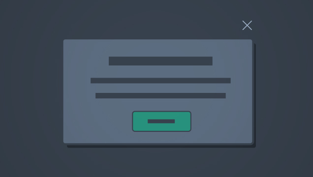 Modals
Modal windows are secondary content areas that allow a user to focus on a subtask without leaving the context of the current screen. They...
Learn More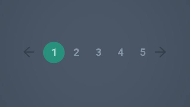 Pagination and View More
Pagination & View More are controls that allow users to view additional records within a data set.
Learn More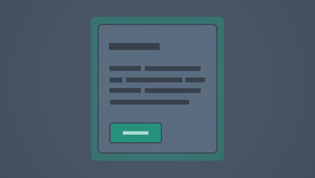 Panels
Panels are a type of container that provide a means of grouping and arranging sections of content in a visually pleasing manner. Panels m...
Learn More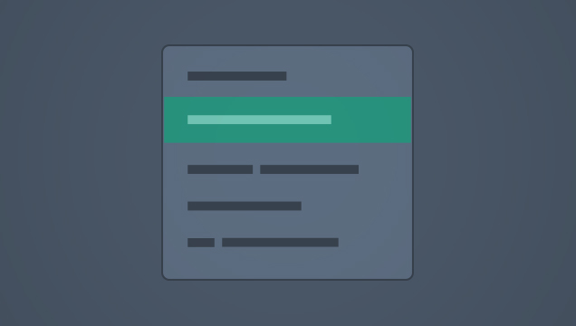 Panel Menu
Panel menus are used to display links related to a section of an application.
Learn More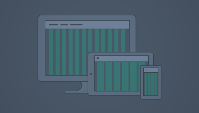 Responsive Grid
The 12-column responsive grid allows layout and content to be resized based on screen resolution.
Learn More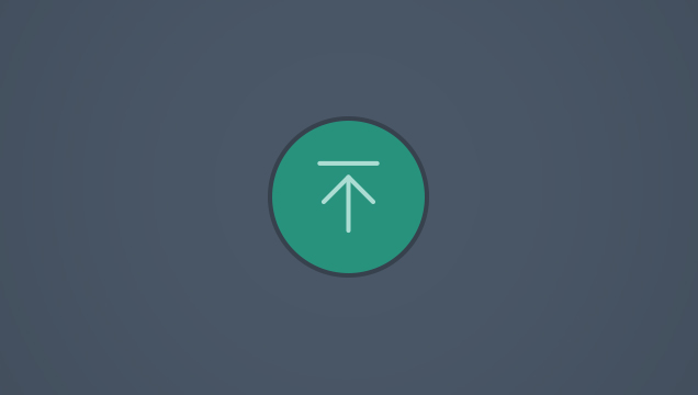 Scroll to Top
The scroll-to-top button allows the user to quickly return to the top of a page.
Learn More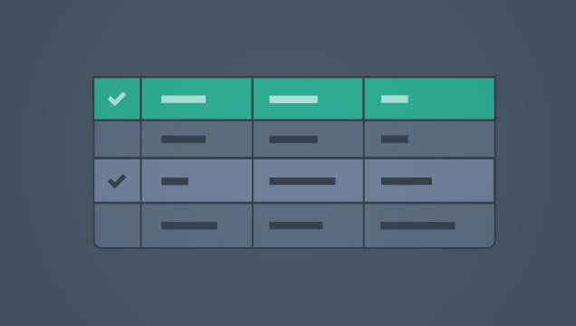 Tables
Tables display related data in a series of columns and rows to allow users to compare, analyze or edit large sets of information.
Learn More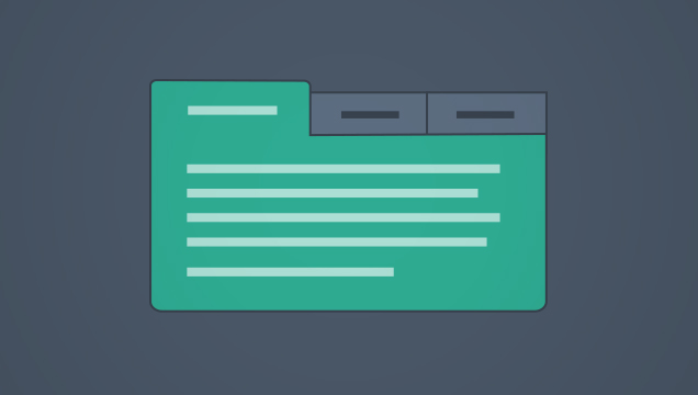 Tabs
Tabs
Tabs allow users to explore multiple views of a related data set.
Learn More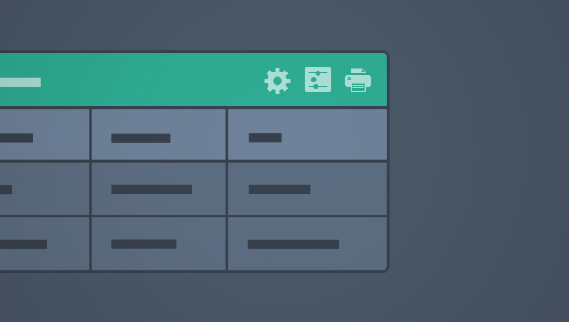 Toolbar
Toolbars provide access to functions related to a single screen or container within a screen. They may appear in Tables, Panels, and othe...
Learn MoreData Visualization
 Introduction to Data Visualization
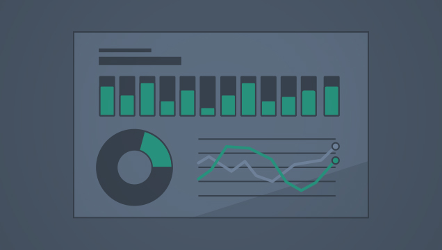
Our approach to data visualization is in keeping with the broader guiding principles of Spark
Learn More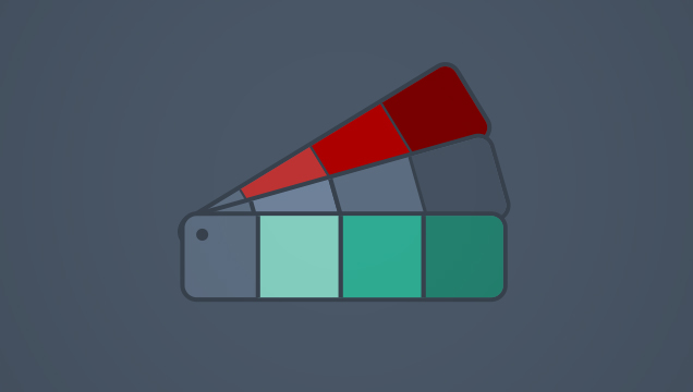 Color Palettes for Data Visualization
Color should be used in a manner that is consistent with the Spark Color Palette
Learn More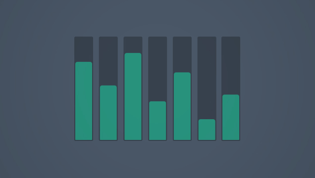 Bar Charts
Bar charts are used to compare the relationship of a data set against two measurements or points of interest, illustrated along horizonta...
Learn More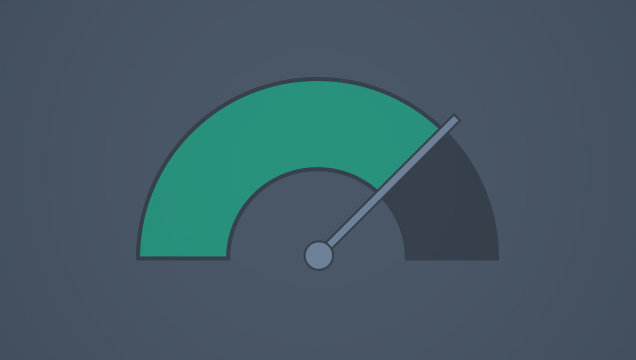 Gauges
Gauges are designed to display real-time information to help monitor business operations. They are similar to KPIs, but differ by focusin...
Learn More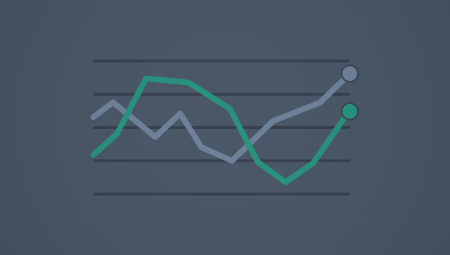 Line Graphs
Line graphs display data points connected by a line. They may include a single line to represent one category within the data set or mult...
Learn More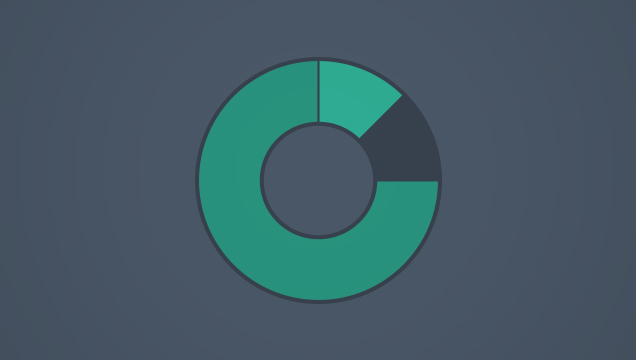 Pie and Donut Charts
Pie charts are circular charts used to illustrate the relative value of each category making up a larger whole.
Learn MoreForm Elements
 Buttons
Buttons allow users to perform actions.
Learn More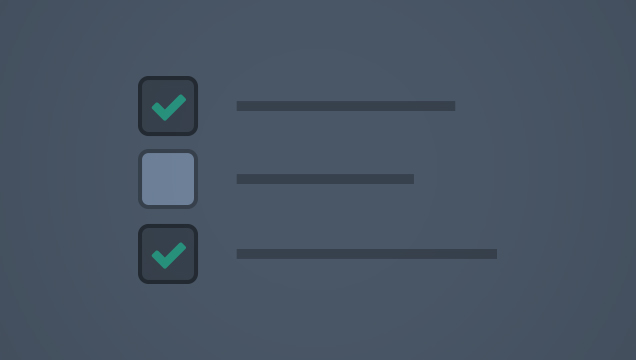 Checkboxes
A checkbox allows a user to select one or more items from a set of options. It may also be used to agree to a statement.
Learn More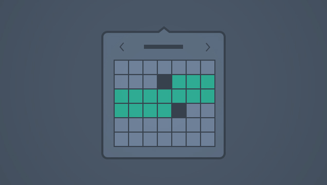 Date Selection
Date Selection allows users to specify a single date or a range of dates.
Learn More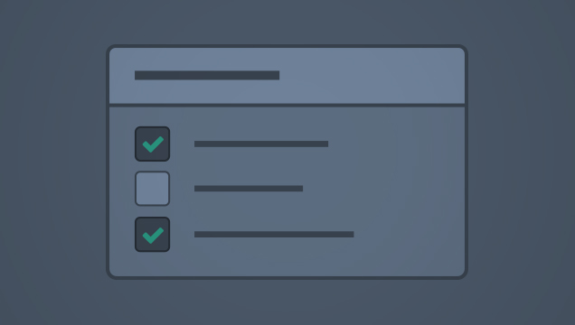 Multi-Select
A Multi-Select input is a form control for selecting multiple items from a list of options. There are two variations in Spark: a custom c...
Learn More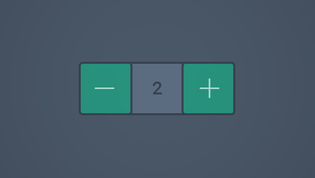 Number Selector
A number selector allows the user to add or remove quantities incrementally.
Learn More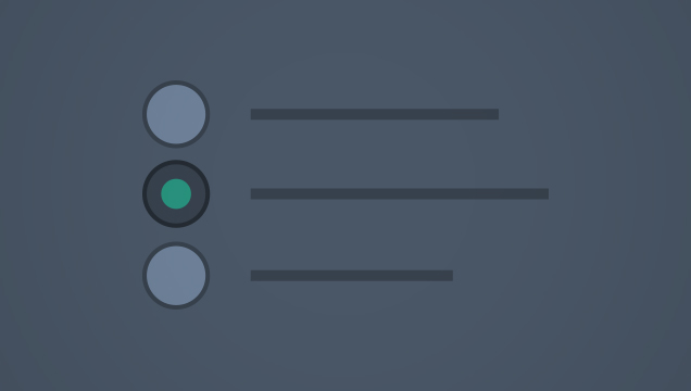 Radio Buttons
Radio buttons allow users to select a single option from a set of options.
Learn More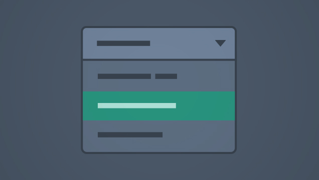 Select Input
A select input is a form control for selecting a single item from a list of options.
Learn More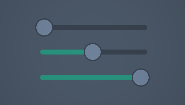 Sliders
Sliders allow users to select a single value or multiple values from a defined range.
Learn More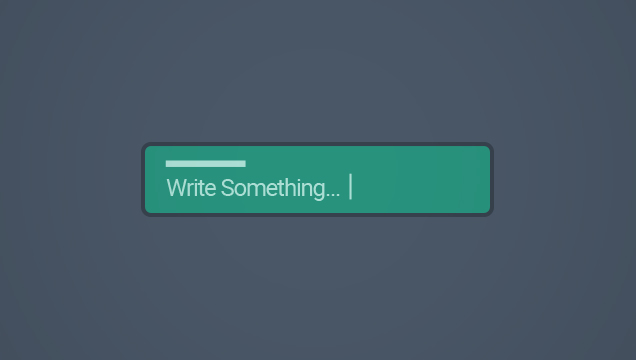 Text Input
Text input fields allow users to enter or edit text.
Learn More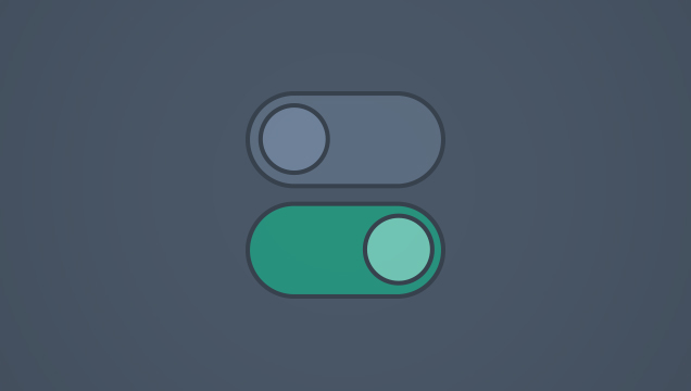 Toggles and Switches
Toggles can take one of three forms: text-based toggles, icon-based toggles or switches.
Learn MoreMessaging & Content
 Links
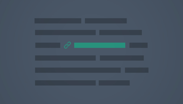
Links
Inline text links are used to provide navigation to another screen and/or to prompt additional information to be displayed on the current...
Learn More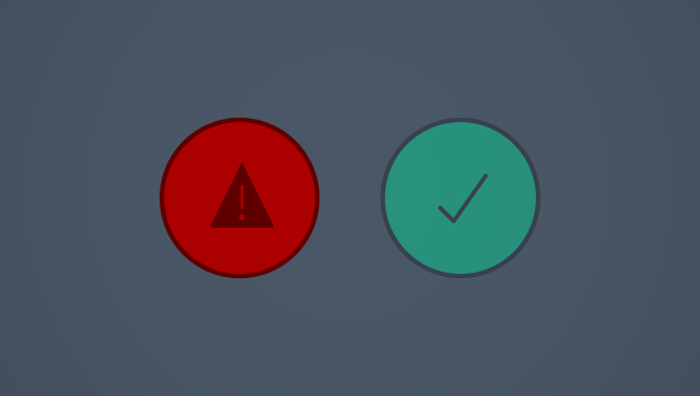 Messages
Messaging is used to communicate important information related to a screen, section of a screen, or specific form field. Messages may app...
Learn More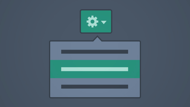 Popovers
Popovers are a type of container that appear over existing content on the page. Popovers allow users to either enter additional data rela...
Learn More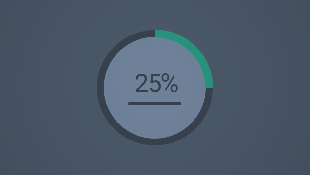 Progress Indicators
Progress indicators inform the user that something is happening and give users confidence that things are going smoothly
Learn More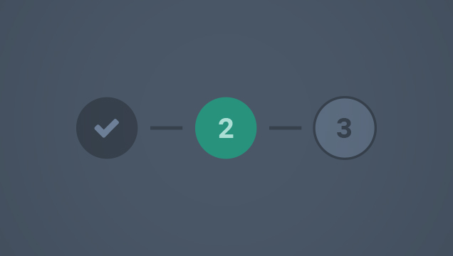 Step Indicator
The Step Indicator guides users through a number of steps across multiple screens in order to complete the task.
Learn More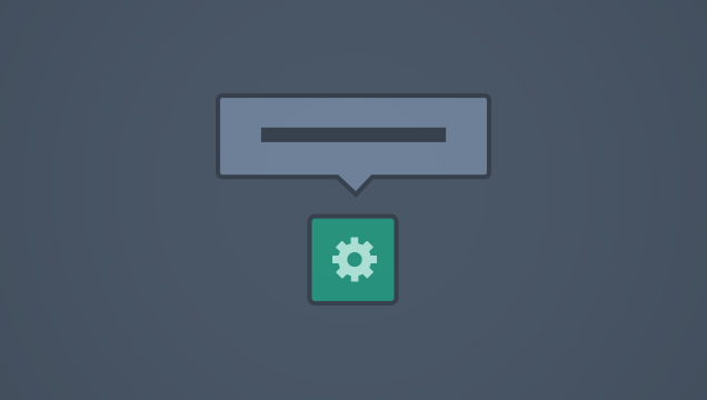 Tooltips
Tooltips are brief labels that may be displayed when the user hovers over a link, button or icon on desktop.
Learn MorePage Templates
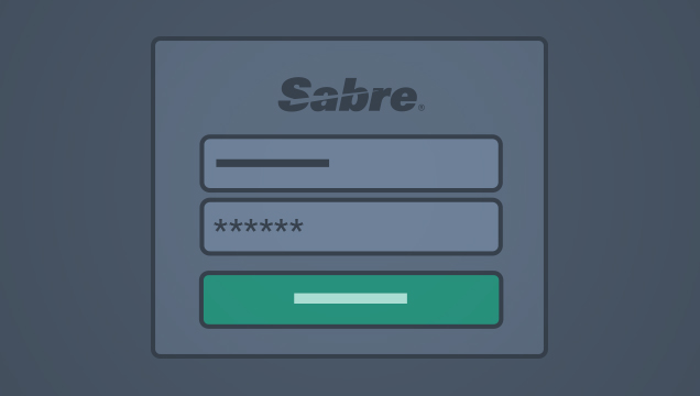 Sign-In Screen
A sign-in screen is displayed when a user must provide a username, password or other credentials before accessing an application.
Learn More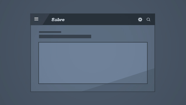 Single Container Layout
This layout provides a starting point for screens that don’t require a side panel menu.
Learn More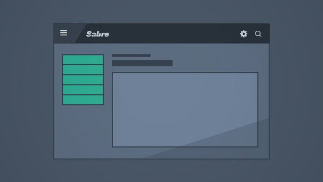 Single Container with Side Menu Layout
This layout provides a starting point for screens with a side panel menu.
Learn More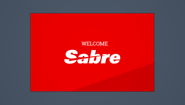 Splash Screen
A splash screen is an optional screen that may appear when the user first opens an application.
Learn More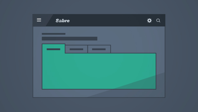 Tabbed Container Layout
This layout provides a starting point for screens that use a tabbed set as the primary content container and don’t require a side panel m...
Learn More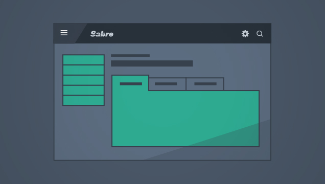 Tabbed Container with Side Menu Layout
This layout provides a starting point for screens displaying a basic panel container with a side panel menu.
Learn More